Monday, 16 May 2016

End of Module Evaluation


Leeds College of Art
BA (Hons) ILLUSTRATION
Level
04
OUIL402 Personal & Professional Practice 1
Credits
20
End of Module Self Evaluation

NAME
Leah Haywood


1.  What learning have you inherited through this module and how has it impacted on your own understanding of professional practice? Consider yourself as a student at University as much as an illustrator
I think mainly I’ve learnt a lot about research and how it doesn’t have to be just reading a book or browsing the internet. Getting outside, visiting galleries and new places can help inform your research just as well, if not better, than books and internet searches can. It gives you an experience to learn from and so helps you form a more educated opinion on something after having experienced it for yourself. I’ve also learnt as a student about looking after yourself mentally and physically. My mental health has had a large impact on my performance this year and I’ve gradually learnt how to take better care of myself and work around my struggles, I’m looking forward to being able to deal with this a lot better in second year and so getting more enjoyment out of the course.


2. What approaches/ types of research have you found most valuable over this module?
Why did they have such an impact?
Pinterest has had a large impact on me and my practice this year, it’s so easy to find new practitioners who’s work you admire, and this in turn leads to the discovery of new media and processes.
I think the biggest type of research to impact me has to be first hand trips and visits to locations/exhibitions. Having an experience informs your work a lot more that just reading a book or clicking through websites. Also looking at third and second year blogs helped, it gave me a little bit of guidance in some ways and helped me see how different people approach different briefs and tasks.


3. In what way has PPP informed the way your work in other modules and your illustration practice as a whole?
PPP has really helped me understand more about who I am as a person, what kind of work I want to make and why I want to make that kind of work. I used to think I’d draw certain things because I liked them, or I had an interest in that specific thing, this is true for some pieces of work but I’m starting to see how my experiences as an individual can start to inform my work and influence the work that I am making. I think PPP has also helped me to deconstruct and analyse other artists work and this in turn has helped me deconstruct and analyse my own work.


4. What weaknesses can you identify in your PPP submission and how will you address this in the future?
I think one of my weaknesses is that I didn’t go to enough exhibitions or events throughout the year. I feel like I’ve actively research and discovered new artists and illustrators but that I would have benefitted from involving myself more in my practice and getting out there and experiencing different things that would inform my practice. I hope in the future I can push myself to get out a bit more and discover some new things through exhibitions and events, and that this in turn will help me to further my practice.


5. What communities of practice and professional contexts do you intend to investigate further as you approach level 5? Why do they appeal to you?
I think something I would definitely like to investigate and involve myself in more is zine culture. I love the idea of being able to spread and share thoughts and ideas through little publications and I also have an interest in narrative which I’d like to explore further.
I would also like to be attending more exhibitions and events and maybe even participate in a few more, such as Illustration Showdown, this will give me a chance to network and meet other creatives.


6.How would you grade yourself on the following areas:
(please indicate using an ‘x’) 

5= excellent, 4 = very good, 3 = good, 2 = average, 1 = poor

1
2
3
4
5
Attendance


x

Punctuality


x

Motivation


x

Commitment


x

Quantity of work produced


x

Quality of work produced


x

Contribution to the group

x


The evaluation of your work is an important part of the assessment criteria and represents a percentage of the overall grade. It is essential that you give yourself enough time to complete your written evaluation fully and with appropriate depth and level of self-reflection. If you have any questions relating to the self-evaluation process speak to a member of staff as soon as possible.

Presentation Slides

Illustrated Self - Final Poster


What I like: 
. The colours work well together, I was a bit skeptical about using blue and yellow but it worked out a lot nicer than I thought it would 
. Layed out well, things are spaced out pretty good, doesn't look too cluttered but doesn't look empty either
. Definitley more my kind of thing. This is one of the few pieces of work that I've produced this year that I'm happy with, I'd like to push myself further with this 
. Managed to represent myself without having to draw a picture of myself

What I don't like: 
. Some of the paint isn't applied great
. Didn't rub my pencil marks out before I started painting so some of them are still visible, especially under the yellow paint 
. If I did this again, I'd probably expand it? Or make some of the little icons a little bigger maybe

Overall I'm pretty happy with this, it's a good piece to end the year on. I think it reflects me well as an individual and an illustrator and has allowed me to work in a style that I enjoy working in, I hope this is something I can bring forward with me into second year. 

Sunday, 15 May 2016

Illustrated Self - Development

Thing I want to include in my finished poster:
. plants, leaves, flowers - representing nature and growth
. main icon would be a hand holding a pencil - represents me as a creative, this will be central with all the other motifs and symbols floating around
. scissors, ink, pens, pencils - represents tools and media
. coffee mugs, crystals, dogs and skateboards - personal interests and things that i like
. books, sketchbooks - represent research, learning and development
. clock, calendar - showing time management and passing of time
. owl - represents leeds, leeds is where I was born, I moved away for quite a while and now I'm back and i love being here so much.


I started off with some simple line drawings of plants and leaves to get into the flow of things, I really liked how these turned out, they have a delicate appearance and are quite simple yet I think the simplicity of the line does add bit of personality or character to the drawings? 

I wanted to add colour and decided to go with a yellow and blue, I don't think the colours will be this bright when I do my final poster, it's just they were the only ones I had that were closest to the colours that I wanted. I'm a lot happier with the direction this is going, it's definitely a lot more in line with the work that I've been producing at home and it's nice to finally be able to start combining the two. 


Pretty sure I'm just going to paint my poster. I like producing work that looks a little more handmade, so I think just sticking to hand crafting my poster will be nice, I think I've had enough vectors for this year. I'm a lot happier with this idea than I was with my previous one, this feels a lot more like my work and it's something that I've enjoyed sketching out and developing, I'm looking forward to seeing  how my final poster turns out. 


Illustrated Self - Written Diagram Number 2


I made another little diagram that was bit more simple but that helped me see how things linked up. I think one of the big things for me is that right now being outside and spending time in nature or with animals is really helping me. It's doing my mental and physical health a hell of a lot of good and that in turn is inspiring my work, and helping me become a better practitioner by giving me a bit of time away from my desk so I can focus when I come back to working on something.

After making this it was a lot easier to see how different aspects of my life and personality linked up and how they in turn linked up with my practice. I think I'm going to sketch a few bits and pieces out and try and create something a bit more 'me'.

Change of Plan

I've changed my mind! I want to do something different!

I was working on the positives for my screen print and i thought why am I doing this again? Why am I trying to make work that I think will fit what other people like? Why can't I just do something that I like? 

I feel like sometimes there's a lot of pressure to create work that fits a certain style or that people will find playful or funny and it's just not me. I prefer work that's bit more delicate and that provokes a feeling or emotion, drawings that are quiet subtle and delicate. And I'm only just starting to realise that there's nothing wrong with that at all, I can still make that kind of work and honestly, it doesn't matter if people like it or not, I really need to push myself to be happy with the work I'm producing and start working in a way that i enjoy and I think this poster could be the first little step towards finding my feet a little bit. 

Illustrated Self - Poster Ideas

 I started to develop a few ideas that I had floating around. I like the idea of symbolising loads of stuff that had popped up on my written diagram and placing it all together to create this big bundle of 'me'

One idea that I thought would work really well was to have an image of the back of a jacket, with loads of patches and images sewn onto the back. Each of the patches would represent a different aspect of myself and my personality/practice. I thought this was a cool idea because it's personal too me, it fits the kind of things that i'm into and I thought it was more original that some of my other more cliché ideas.

I developed my rough into a larger pencil drawing and then made a quick copy in colour. I've really enjoyed looking at work that includes limited pastel colours and it's something that I've tried to incorporate into my work and would like to try and incorporate into this piece.


I think I'll most likely be screen printing this, the bold blocky colours would look nice screen printed and I could get away with just using two colours and overlapping them to create a third.
Pretty sure this is what I want to do for the final poster.

Illustrated Self - Written Diagram


I made two written diagrams so I could try and see where things began too overlap.

I find stuff like this so difficult, I have a fairly negative perception of myself and so struggle to find positives in my personality or my practice.
I also struggled to see where my personality and my practice overlapped. This year I've noticed a massive gap between the work I produce for uni and the work I produce for myself and this became more evident to me when I started trying to do this written diagram. I feel like I make a lot of work for myself that connects to my interests, experiences and personality and yet the work I'm producing for uni is usually stuff that I don't enjoy working on and that I feel I'm doing just so that other people will like it?

I'm going to try and push myself with this poster and let myself come through a little bit, I think I'll just move onto roughs for now and see what happens.

I don't want to do this presentation at all.

I really really really don't want to do this.
I really don't have the confidence in myself or in my work to stand up in front of people and talk about how shit this years been.
I feel so ashamed and embarrassed about struggling so much, I just don't want to talk about any of it, but theres no point lying in this presentation and trying to make out as if this has all been fine and i've really enjoyed myself, because I haven't...
I don't know, maybe I'm just overthinking and getting overly nervous but I honestly can't think of many things worse than having to stand up and talk about everything.

Presentation Initial Thoughts - Type Up from Sketchbook Notes

Slide 1 
- Introduction, who I am
- How has this year been? (hella hard) 
- How has this affected me and my practice? 
- How I want to move on from this

Slide 2
- Where I was at the start of the year - excited, eager, wanting to explore new mediums and ways of image making
- Wanted to expand my knowledge of illustration, discover new applications of illustration and new practitioners
- What I expected from first year and what first year was actually like 

Slide 3 
- What new mediums have I explored - shape, texture, vectors, collage, 3D (burgh), composition
- What new practitioners have I discover? - Irana Douer. Lizzy Stewart, Laura Callaghan, Gemma Topliss, Talulah Fontaine 
- Why do I like this things? What don't I like? How has this influenced me? 

Slide 4 
- Where am I now/Mistakes? 
- Not coming in - Depression (do i mention this? do i leave it out?)
- Limiting myself through my sketchbook size
- Quanitity and quality of work has been a huge disappointment and something that I'm really ashamed of

Slide 5 
- Work I've done this year that i want to talk about/include?
- Typology
- Otley book
- Some work from visual Language? 
- Vector Postcards

Slide 6 
- Personal Work vs Uni Work 
- How do I break this boundary? What am I going to do about it? 
- How do I incorporate more of myself, my thoughts and my personality, into my work? 

Slide 7 
- I have done some good things this year
- From where I was a few months ago I've come quite far - boosted my confidence
- Illustration showdown - Networking - Confidence - Self Promotion - Becoming more involved in my practice
- I've really picked myself up lately, I've got back into the swing of things, I'm looking forward to a break and to come back in 2nd year with a fresh mind and a better approach to my practice

Slide 8+9 
- Next year I want to develop a more specific style/way of working
- Get involved in the studio space more
- Involve myself, immerse myself in my practice 
- Narratives and emotive work 
- Let my personality and experiences push through

Slide 10 
- Illustrated self - talk through it 

Slide 11 
Top Tip 
- Rest - don't overwork yourself 
- Look after yourself mentally and physically 
- This course is really important to me but I've learnt that if I don't look after myself I'm not going to be able to reach my full potential. 


This needs some serious refining, maybe a bit more planning out but these are some of the main things that I want to cover in my presentation. 
I'll probably come back to this and adjust it or add things too it later on. 

Friday, 6 May 2016

Illustration Showdown at Outlaws Yacht Club

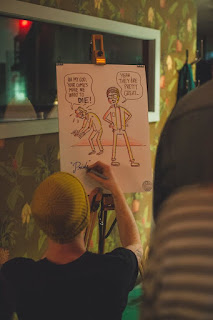
So, one the 27th of April I held a stall at the first Illustration Showdown event in Leeds at Outlaws Yacht Club. I was so nervous but there was a really great, supportive atmosphere from all the people involved, stallholders and battlers were really lovely and it was so nice to feel like a part of this little creative community. There was loads of cool work by a range of different artists and illustrators and I even managed to sell a few of my own pieces of work that I'd taken along!


Here are a few photos from the night, taken by Kate McMillan

Part of the night was an Illustration battle, each round the two artists were given a theme and had to draw based around that theme and then everyone else would vote on a winner. 


The most awful picture of me to exist in all of time


Ladyfuzz and other cool things


It was really great to take part in something like this, I think it did my confidence a lot of good, especially with me actually selling some stuff. I was terrified of turning up there and everyone thinking my work was shit and not buying it or looking at it but I got some really positive feedback so I'm feeling a fair bit more confident in myself and in my work. I got asked if I'd like to take part in the next one which should be at Nation of Shopkeepers so hopefully I'll be able to take part in that! 
I think this kind of thing is something I;d like to do more of, it's a great way to network and meet other creatives and a great way to get your work out there a little bit!

Thursday, 5 May 2016

OUIL402 PPP - Feedback and Reflection on Posters

In this session we were asked to rate and evaluate our posters that we made for the Personal, Professional and Ambitions task. I rated my posters from 1 to 3 with 1 being the best and 3 being the worst

1 - Ambitions
2 - Personal
3 - Professional

Ambitions - The task helped me realise what kind of work I want to be creating, emotive work that evokes a feeling or emotion in the viewer. I'm still not sure how I'm going to do it and what area of illustration I want to go into but now I know what kind of work I want to be making at least. I've struggled a lot trying to figure out what I want to do and where i want to give after the course so this helped me gain a bit of perspective.

Personal - Sums me up in a nutshell really, kind of gives an idea about my personality and what I enjoy. I did find this poster hard to do though, it's difficult to talk about myself and not just list a load of crappy qualities.

Professional - Promotes that I can draw kind of okay and is quite funny in that it pokes fun at my weaknesses. But is that a bad thing? That it highlights something that I can't do well? Maybe I should try and avoid this and focus on better qualities.


We swapped our work with another table and they had to choose which they thought was my best poster and why. This is the feedback I got:

Professional - Obvious, humour. Works well as a series and has consistency. Funny approachable tone.

I was happy with the feedback I got. I wanted my posters to work as a set together and also give of the sense that I am an approachable person. I was glad that they found it funny aswell, there were no comments made about me highlighting something i'm crap at, it seemed to work well so maybe it's not such a bad thing, everyone has their weaknesses after all.